 anemos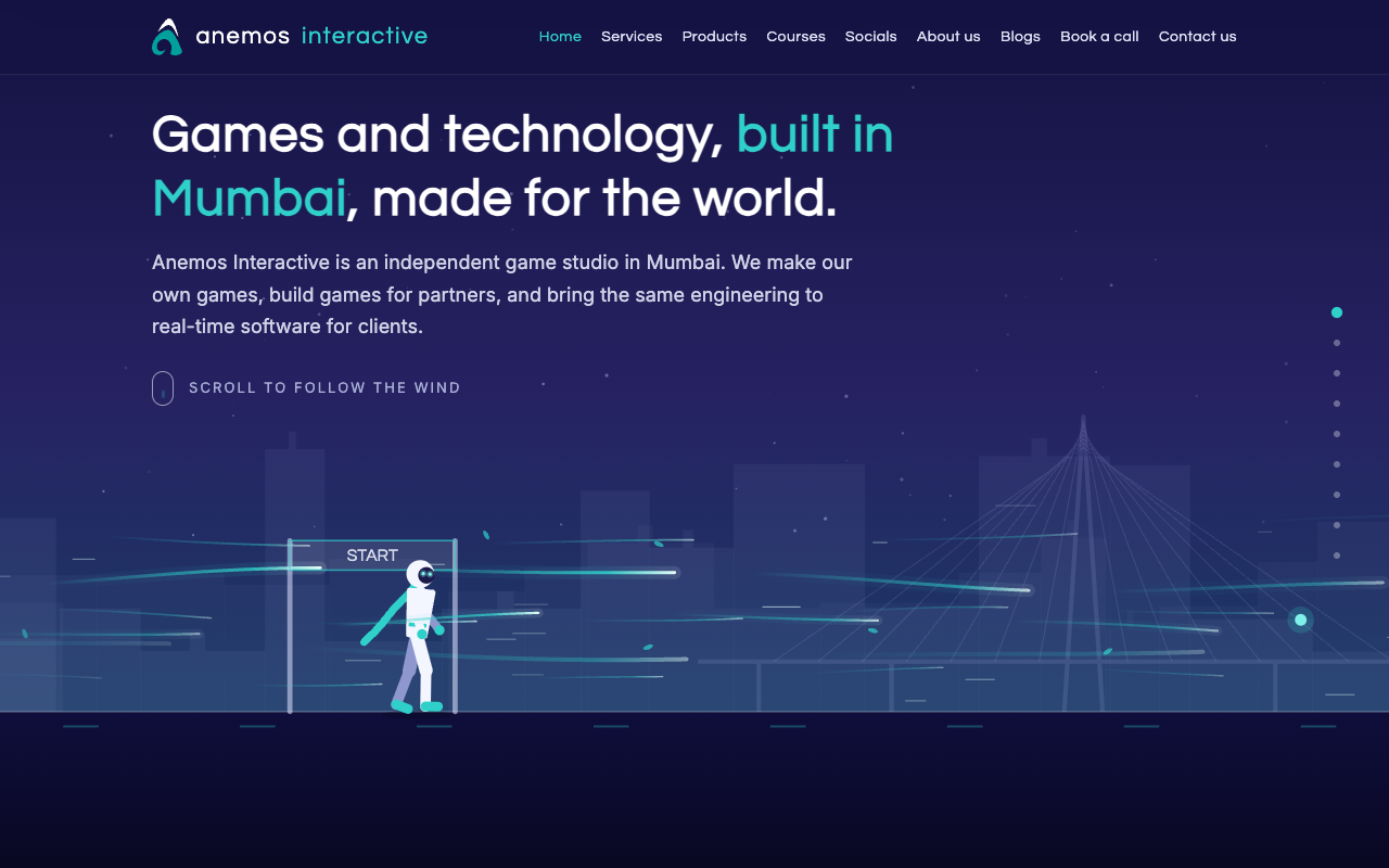
We make games, so when it came to building our own website the one thing we agreed on was that it should not feel like a brochure. This is the story of how it turned into a small game instead, what we chose to build it with, and the things we got wrong on the way.
The one-line brief
The whole idea fitted in a sentence: a runner on an obstacle course, guided by the wind, and the text appears as you scroll.
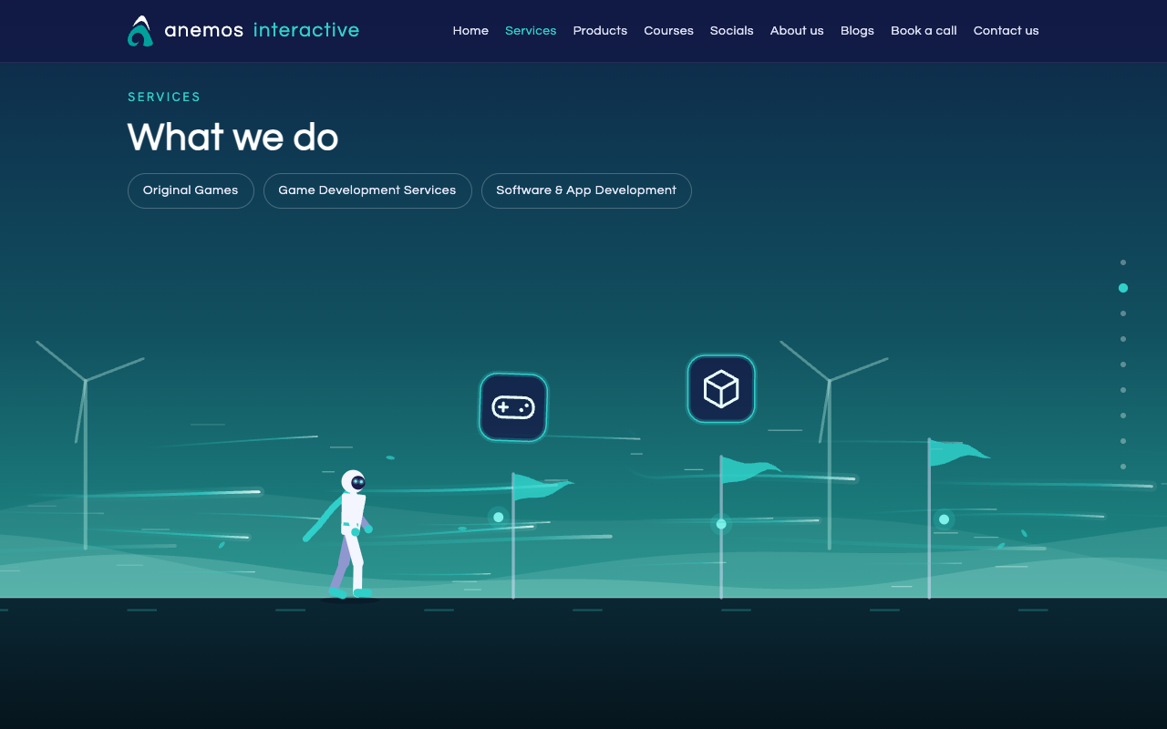
That became the home page. A runner waits at a start line. As you scroll, the wind pushes them along a course, and every stop on the course is a part of the site: what we do, the game we're building, courses, where to follow us, who we are. The copy for each stop blows in word by word as the runner reaches it. At the end of a section there's a hoop; run through it and the wind carries you to the next page.
Choosing the tools
We spent the first ten minutes of the project on the question every project starts with: should we use a framework? We listed what the site had to do — show nine pages and make a small person run — and realised a framework would mostly be a build pipeline shipping a runtime larger than the site itself. So there is no framework. The site is files in a folder, and you can open it from your desktop.
The run is drawn on a plain 2D canvas. WebGL was tempting, and on brand, but it means shaders, GPU quirks on cheap phones and a blank rectangle on anything old. Canvas 2D draws lines and circles; our runner is lines and circles; every browser from the last eight years can do it.
One rule we kept re-learning: the words have to be real text. It's easy, when you're drawing a world, to draw the words into it too. Then search engines can't read them, screen readers can't read them, and the one visitor with JavaScript off gets a beautiful empty sky. Every word on the site is ordinary HTML laid over the canvas. The canvas only draws things that don't need reading, like a sign that says START.
What the feedback changed
Most of what's good about the site came from someone telling us something looked wrong.
- It was too fast. One flick of the scroll wheel and you'd skipped three sections. We stretched the scroll distance again and again until it felt like walking through it, and added a column of dots so you can jump or drag to any stop.
- It had to work everywhere. From a 4K monitor to a 300-pixel phone, folded and unfolded, upright and sideways. Sideways phones got their own layout: copy on the left, the run on the right.
- Slow connections broke it. People in low-bandwidth areas told us the page jumped to the end before it had loaded. The fix was a loading screen that only appears when it's needed, waits until about 60% of the site has arrived, and never shows on a return visit.
- The copy overclaimed. A few people in the industry read it and told us where it sounded like every other studio. It was rewritten until it didn't.
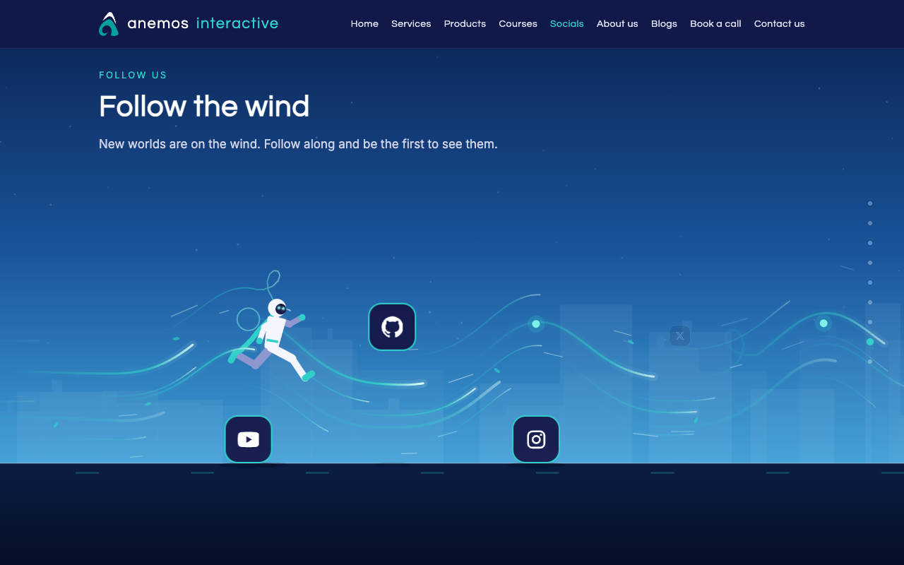
- Small things. The purple that looked off. The logo touching the edge on small phones. The social-media tiles that made the runner jump too often — now they alternate, hop one, duck under the next.
We wanted the site itself to feel like one of our games. The best compliment so far has been "I forgot I was on a website."
Hosting, and not thinking about it again
The site started on Netlify. It was fine, until it put a login wall in front of our preview link, which defeats the point of a preview link. Our domain's DNS already lived at Cloudflare, Cloudflare hosts static files for free with no bandwidth charges, and the deploy is one command. The move took an afternoon and we haven't thought about hosting since — which is the highest compliment hosting can get.
A static site can't receive a form, so the contact form posts to a service whose only job is turning a form into an email. Bookings go through Microsoft 365, which we already pay for and which already does time zones, reminders and calendars. Analytics runs behind a consent line: nothing is stored on your device until you say yes.
This blog
The blog you're reading is the only dynamic part of the site. Posts live in a small database at the edge, images in a bucket next to it, and the same code that serves the site renders them. We write in Markdown with a bar of buttons so nobody has to remember that two asterisks mean bold. Signing in to the admin uses our Microsoft accounts, so we built no login system and got multi-factor authentication for free.
It's about nine hundred lines, it costs nothing to run, and we understand every one of them.
What's next
The site is open source now — the code is on our GitHub, with a longer write-up of every decision in the README. We'll post here as the game and the studio grow. If you've read this far, follow along, or tell us what looked wrong.